Glyphs
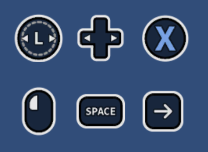
Rewired includes a glyph system that can be used to display glyphs for controller elements. Rewired comes with a default set of glyphs for some commonly-used controllers and components to display them in Unity UI. (Unity 5+)
The glyph system was written to be highly customizable. The included glyph sets use Unity's Sprite and Unity UI, but the system could be modified to use any data format or UI system (advanced developers only).
Contents
- Installation
- Quick Setup
- Namespace
- Important Classes
- Glyph Provider
- Unity UI Player Controller Element Glyph
- Unity UI Controller Element Glyph
- Unity UI Default Controller Element Glyph Settings
- Glyph Set
- Glyph Set Collection
- Custom Glyph Types (Advanced)
- Unity UI Text Mesh Pro Glyph Helper
- Accessing Glyphs from Scripts
- Key Format
- FAQ
Installation
Install the Glyphs pack from the menu:
- Window -> Rewired -> Extras -> Glyphs -> Install
Rewired will automatically install an additional addon pack if Text Mesh Pro is installed in the project. If you installed the glyphs pack before Text Mesh Pro was installed, you will be unable to use features that are dependent upon Text Mesh Pro. After installing Text Mesh Pro, install the glyphs pack again.
Uninstalling
Delete the Rewired/Extras/Glyphs folder.
Quick Setup
Add the Glyph Provider component to the Rewired Input Manager (or a child object) by selecting the Game Object and from the menu:
- Component -> Rewired -> Glyphs -> Glyph Provider
This will add the component and automatically assign the default glyph collection.
Displaying Glyphs
To display a glyph, select a Canvas (or child of Canvas) and create a Unity UI Player Controller Element Glyph from the menu:
- GameObject -> Create Other -> Rewired -> Glyphs -> Unity UI -> Unity UI Player Controller Element Glyph
Set the required inspector options:
- Player Id: The id of the Player.
- Action Name: The name of the Action.
- Action Name 2: The name of the second Action. (Optional)
- Action Range: The range of the Action for which to show glyphs / text. This determines whether to show the glyph for an axis-type Action (ex: Move Horizontal), or the positive/negative pole of an Action (ex: Move Right). For button-type Actions, Full and Positive are equivalent. If displaying two Actions, this has no effect.
Or, see this to display glyphs inline in Text Mesh Pro text.
Namespace
All Glyph-related classes are in the Rewired.Glyphs namespace.
using Rewired.Glyphs;
// If using Unity UI classes
using Rewired.Glyphs.UnityUI;
Important Classes
- ReInput.GlyphHelper - Provides access to all glyph-related members. Access via ReInput.glyphs.
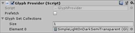
Glyph Provider
The glyph provider is responsible for performing a string key lookup and returning a glyph. A glyph provider is required to use the glyph system.
Any class that implements Rewired.Interfaces.IGlyphProvider can be used as the glyph provider by assigning it to ReInput.glyphs.glyphProvider. The GlyphProvider component implements this interface and sets itself as the glyph provider in OnEnable. (The glyph provider should always null the ReInput.glyphs.glyphProvider property when no longer needed, usually in OnDisable.)
If you want to implement your own glyph provider, you can extend the GlyphProvider class, or create a new class that implements Rewired.Interfaces.IGlyphProvider.
GlyphProvider
The GlyphProvider component is the default implementation of a glyph provider.
Add the Glyph Provider component to the Rewired Input Manager (or a child object) by selecting the Game Object and from the menu:
- Component -> Rewired -> Glyphs -> Glyph Provider
Glyphs are cached when returned from the glyph provider. This prevents wasting CPU resources by constantly doing expensive string key lookups. The glyph cache can be cleared by calling ReInput.glyphs.Reload. The cache will also be cleared automatically after setting a new glyph provider.
You might want to create a different set of glyphs to display different characters for keys on for the specific language of keyboard in use, for example. You can create your own Glyph Set and swap out glyphs based on the current keyboard in use. (Note: Rewired does not provide any keyboard layout or locale information from the operating system on any platform. This would have to be implemented by the developer on a per-platform basis.)
You can either change out the entire Glyph Set Collection in the Glyph Provider, or you can change out one or more Glyph Sets assigned to a particular collection. When the collection list is replaced in Glyph Provider, it will automatically collect all the glyphs from all chained glyph collections and clear the glyph cache so glyphs can be reloaded. If you change an element in the collection list or one of the chained collections, you must call GlyphProvider.Reload to collect all the glyphs and clear the glyph cache.
You can also replace the Glyph Provider and all cached glyphs will be cleared automatically. Just set ReInput.glyphs.glyphProvider to your new provider.
Unity UI Player Controller Element Glyph
This component will display, by default, the first found controller element glyph(s) or text bound to a particular Action, Player, and Action Range. If a glyph is not available, text will be displayed instead.
It is important to understand that the purpose of this component is for displaying UI help glyph / text to show the user what controller element to press to activate an Action. In most cases, this is used to display the glyph for the last active controller. By default, this component selects the first match it finds in the Player based on the specified criteria. By default, it requires that the Player currently contains a Controller and an enabled Controller Map with at least one enabled binding to the Action in question. (For more advanced use cases, see custom filtering of results, custom result selection, and displaying glyphs for controllers not currently connected.)
If you are attempting to display glyphs in a control rebinding UI, this is not the correct component to use. Use the Unity UI Controller Element Glyph component instead.
Create a GameObject with the default values from the menu:
- GameObject -> Create Other -> Rewired -> Glyphs -> Unity UI -> Unity UI Player Controller Element Glyph
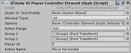
| Glyph or Text Prefab | If set, when glyph/text objects are created, they will be instantiated from this prefab. If left blank, the global default prefab will be used. |
| Allowed Types | Determines what types of objects are allowed.
|
| Options | Optional reference to an object that defines options. If blank, the global default options will be used. |
| Action Range | The range of the Action for which to show glyphs / text. This determines whether to show the glyph for an axis-type Action (ex: Move Horizontal), or the positive/negative pole of an Action (ex: Move Right). For button-type Actions, Full and Positive are equivalent. This value has no effect when displaying two Actions. |
| Group 1 | Optional parent Transform of the first group of instantiated glyph / text objects. For a single Action query, if an axis-type Action is bound to multiple elements, the glyphs bound to the negative pole of the Action will be instantiated under this Transform. For a two Action query, if multiple glyphs are returned, the glyphs bound to the first Action will be instantiated under this Transform. If a single glyph is returned, it will be instantiated under this Transform as well. This allows you to separate results by negative / positive binding or Action 1 / Action 2 in order to stack glyph groups horizontally or vertically, for example. If an Action is only bound to one element, the glyph will be instantiated under this transform. If blank, objects will be created as children of this object's Transform. |
| Group 2 | Optional parent Transform of the second group of instantiated glyph / text objects. For a single Action query, if an axis-type Action is bound to multiple elements, the glyphs bound to the positive pole of the Action will be instantiated under this Transform. For a two Action query, if multiple glyphs are returned, the glyphs bound to the second Action will be instantiated under this Transform unless there were no results found for the first Action, in which case they will be displayed under group1. Otherwise, if a single glyph is returned, it will be instantiated under group1. This allows you to separate results by negative / positive binding or Action 1 / Action 2 in order to stack glyph groups horizontally or vertically, for example. If an Action is only bound to one element, the glyph will be instantiated under group1 instead. If blank,If blank, objects will be created as children of either group1 if set or the object's Transform. |
| Result Index | The index of the result to return. This can be used to return, for example, the second matching glpyh(s) instead of the first found. This will be ignored if you are using a custom result selector. |
| Action 1 First Pole | Determines the display order of split-axis and button glyphs for the first Action. When two glyphs for a axis-type action are displayed, this determines which pole is displayed first. |
| Action 2 First Pole | Determines the display order of split-axis and button glyphs for the second Action. When two glyphs for an axis-type action are displayed, this determines which pole is displayed first. |
| Player Id | The Player id. |
| Action Name | The Action name. |
| Action Name 2 | The second Action name for 2D Actions. (Optional) |
Various options can be set that determine which glyph will be selected. This includes choosing to use the last active controller or not, the priority order of different controller types and controller element types, and other options. For example, you might choose to prioritze keyboard glyphs over mouse glyphs or vice versa. (In this class, the keyboard and mouse are treated as a single controller for the purposes of last active controller.)
If the options field is left blank, it will use the default options specified in ControllerElementGlyphSelectorOptions.defaultOptions. You can set this value or change the individual options values and all glyphs that use the default options will reflect these changes. (You can also set the default options in the inspector using this convenience component.) If the options field is set, the local options will be used.
You can create a selector options asset file and share the settings among different glyphs. The options field takes a reference to an object of type ControllerElementGlyphSelectorOptionsSOBase. You can create a ControllerElementGlyphSelectorOptionsSO from the menu:
- Assets -> Create -> Rewired -> Glyphs -> Controller Element Glyph Selector Options
It is important to understand that an Action Element Map may be bound to a number of different controller elements. Also, the two poles of an Action (positive, negative) may be bound on separate Action Element Maps. This means, when querying for an Action Range of Full, it is possible that up to 8 glyphs will need to be displayed. (One set of 3 keyboard modifier keys and 1 primary key for up to the two poles of a split axis Action.) This class handles that, and will instantiate enough child objects as necessary from the specified prefab.
To create the individual glyph or text objects, a prefab is used to instantiate the child objects. By default, no prefab is set, so it will use the current default prefab. By default, it is created automatically by Rewired, but it can be overridden. If a glyph or text prefab is set locally, it will be used, otherwise it will fall back to the default.
The root GameObject of the prefab must include a component that inherits from GlyphOrTextBase.
The default Unity UI glyph or text prefab is specified in UnityUIControllerElementGlyphBase.defaultGlyphOrTextPrefab. You can set this to override the default prefab for all Unity UI glyphs at once by setting that value. (You can also set the default prefab in the inspector using this convenience component.) Existing glyph objects will be automatically rebuilt when changing this value. You should not modify the existing default prefab by changing values on it, but instead replace it with a new GameObject, otherwise existing glyphs will not be rebuilt because they detect changes to the prefab by comparing object references.
The default UnityUIPlayerControllerElementGlyph when created from Component -> Rewired -> Glyphs -> Glyph Provider includes a HorizontalLayout component. In the case multiple glyphs are displayed, they will be aligned horizontally. If you want them to be laid out vertically, remove the HorizontalLayout component and replace it with a VerticalLayout component. Or, you can choose to use any type of layout available in Unity UI, but be aware you may need to replace the prefab used for the child objects to fully control layout.
By default, child objects will be created as children of the primary GameObject. However, for some layouts, you may want to group child objects. The group1 and group2 fields allow you specify Transforms which will be used as the parents for child objects. Most child objects will be displayed under group1, however, if you are querying for a single Axis-type Action, Full Action Range, and it finds a separate binding for each pole of the axis, the glyphs/text for the negative pole will be displayed in group1 and the glyphs/text for the positive pole will be displayed in group2. For a two Action query, if multiple glyphs are returned, the glyphs bound to the first Action will be instantiated under group1 and the glyphs bound to the second Action will be instantiated under group2. If a single glyph is returned, it will be instantiated under group1.
While this is probably a very rare scenario, the most likely use case for this would be in the case of keyboard bindings with modifier keys. For example, if you have bindings to two poles of an Action, Ctrl + A, Ctrl + S, you can stack these groups of horizontal elements vertically to save horizontal space. You would do this by placing a VerticalLayoutGroup component on the primary GameObject, then create two child GameObjects, Group1 and Group2, then on each Group, add a HorizontalLayoutGroup component.
Player and Action Dropdowns in the Inspector

It is recommended that you configure the Player Id and Action Id values using dropdowns in the inspector instead of using raw ints and strings for these values. This avoids possible error, and also makes it a lot easier if you want to change the name of an Action at a later date.
To do this, first you must export constants for your Rewired Input Manager configuration.
Next, create a class that extends UnitUIPlayerControllerElementGlyphBase and add PlayerIdProperty and ActionIdProperty attributes, referencing the exported types. Replace the script reference of the UnityUIPlayerControllerElementGlyph with your new class. (Switch inspector to Debug mode by right clicking the Inspector tab, choosing Debug. The Script field can be replaced with your new script.)
using Rewired;
using Rewired.Glyphs.UnityUI;
using UnityEngine;

namespace MyNamespace {

    public class MyUnityUIPlayerControllerElementGlyph : UnityUIPlayerControllerElementGlyphBase {

        [SerializeField]
        [PlayerIdProperty(typeof(MyRewiredConsts.Player))]
        private int _playerId;

        [SerializeField]
        [ActionIdProperty(typeof(MyRewiredConsts.Action))]
        private int _actionId = -1;

        [SerializeField]
        [ActionIdProperty(typeof(MyRewiredConsts.Action))]
        private int _actionId2 = -1;

        public override int playerId { get { return _playerId; } set { _playerId = value; } }
        public override int actionId { get { return _actionId; } set { _actionId = value; } }
        public override int actionId2 { get { return _actionId2; } set { _actionId2 = value; } }
    }
}
By default, glyphs will be displayed for the first match found in the Player, excluding disabled Controller Maps and Action Element Maps. If you need the ability to define which mappings are displayed, including potentially from disabled Controller Maps or from Controller Maps in only specific Map Categories for example, you can define your own filtering code by setting the ControllerElementGlyphSelectorOptions.isActionElementMapAllowedHandler property.See the code example below for ideas.
using UnityEngine;
using Rewired;
using Rewired.Glyphs;

[RequireComponent(typeof(Rewired.Glyphs.UnityUI.UnityUIPlayerControllerElementGlyph))]
public class GlyphFiltering : MonoBehaviour {

    private Rewired.Glyphs.UnityUI.UnityUIPlayerControllerElementGlyph glyph {
        get {
            return GetComponent<Rewired.Glyphs.UnityUI.UnityUIPlayerControllerElementGlyph>();
        }
    }

    public void OnEnable() {

        // Assign the handler
        if (glyph.options != null) {

            // Custom options have been set in the inspector, override the handler.
            glyph.options.options.isActionElementMapAllowedHandler += FilterGlyphs;

        } else {

            // No custom options, override the global default options.
            // This is not a great idea because it will apply this filter to all glyph components,
            // but shown here just for illustrative purposes.
            ControllerElementGlyphSelectorOptions.defaultOptions.isActionElementMapAllowedHandler += FilterGlyphs;
        }
    }

    public void OnDisable() {

        // Remove the handler
        if (glyph.options != null) {

            // Custom options have been set in the inspector, override the handler.
            glyph.options.options.isActionElementMapAllowedHandler -= FilterGlyphs;

        } else {

            // No custom options, override the global default options.
            ControllerElementGlyphSelectorOptions.defaultOptions.isActionElementMapAllowedHandler -= FilterGlyphs;
        }
    }

    bool FilterGlyphs(ActionElementMap aem) {

        // Exclude disabled ActionElementMaps
        if (!aem.enabled) return false;

        // Exclude if parent Controller Map is disabled
        if (!aem.controllerMap.enabled) return false;

        // Include only if Controller Map is in the "Gameplay" Map Category
        if (aem.controllerMap.categoryId != ReInput.mapping.GetMapCategoryId("Gameplay")) return false;

        // Include only if controller is a Joystick
        if (aem.controllerMap.controller.type != ControllerType.Joystick) return false;

        // Include only if controller element is a Button
        if (aem.elementType != ControllerElementType.Button) return false;

        return true;
    }
}
By default, glyphs will be displayed for the first match found in the Player. If you instead want to manually choose which matching result to display, you can do so by setting a custom result selection handler using the UnityUIPlayerControllerElementGlyphBase.resultSelectionHandler property. After searching for mappings in the Player and collecting all possible results, the handler will be invoked. This can be used, for example, to display the second result found instead of the first. (If all you need is to select a result by index, it's easier just to set the
resultIndex in the inspector instead.) It could also be used to choose results from any user-defined criteria such as controller type, controller map cateogry, etc.
The following is a simple example showing how to set a custom result selector and choose a result by index, for example if you want to display the second matching result found to show glyphs for "primary" and "secondary" controls. Add this component to the GameObject containing the UnityUIPlayerControllerElementGlyph component and set the result index in the inspector.
namespace Rewired.Examples {
    using System.Collections.Generic;
    using UnityEngine;
    using Rewired.Glyphs;
    using Rewired.Glyphs.UnityUI;

    [RequireComponent(typeof(UnityUIPlayerControllerElementGlyphBase))]
    public class UnityUIPlayerGlyphResultSelectionExample : MonoBehaviour {

        [Tooltip(
            "The index in the glyph result list to use. " +
            "If there is no result at the specified index, nothing will be displayed."
        )]
        public int resultIndex = 0;

        private UnityUIPlayerControllerElementGlyphBase glyph {
            get {
                return GetComponent<UnityUIPlayerControllerElementGlyphBase>();
            }
        }

        private void OnEnable() {

            // Set the custom result selection handlers

            // For one Action queries
            glyph.resultSelectionHandler = GlyphResultSelectionHandler;

            // For two Action queries (Optional)
            glyph.result2dSelectionHandler = GlyphResult2DSelectionHandler;
        }

        private void OnDisable() {

            // Unset the custom result selection handler
            glyph.resultSelectionHandler = null;
            glyph.result2dSelectionHandler = null;
        }

        private int GlyphResultSelectionHandler(IList<ActionElementMapPair> results) {

            // You can iterate the list and choose the best result.
            // Return the index of the result to display.
            // This example just returns the result index set in the inspector.

            return resultIndex;
        }

        private int GlyphResult2DSelectionHandler(IList<Pair<ActionElementMapPair>> results) {

            // You can iterate the list and choose the best result.
            // Return the index of the result to display.
            // This example just returns the result index set in the inspector.

            return resultIndex;
        }
    }
}
Unity UI Controller Element Glyph
This component displays glyphs / text for a specific Action Element Map or Controller Element Identifier using Unity UI.
This component cannot be used alone. It requires a script to set either the actionElementMap property or the controllerElementIdentifier and axisRange properties. This is mainly useful if you need to display a glyph for a specific controller element, such as when showing a list of glyphs for controller elements in a controller or when showing glyphs for controller elements currently contributing to an Action value. If you want to display a glyph for a controller element bound to an Action for a Player, use Unity UI Player Controller Element Glyph instead.
Add component from menu:
- Component -> Rewired -> Glyphs -> Unity UI -> Unity UI Controller Element Glyph
Inspector
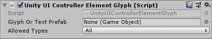
| Glyph or Text Prefab | If set, when glyph/text objects are created, they will be instantiated from this prefab. If left blank, the global default prefab will be used. |
| Allowed Types | Determines what types of objects are allowed.
|
Unity UI Default Controller Element Glyph Settings
This is a convenience component that allows you to set default Unity UI glyph settings in the inspector. This allows you to change settings easily in one place and any glyph component that has nothing set in the options field will fall back to these values.
Add component from menu:
- Component -> Rewired -> Glyphs -> Unity UI -> Unity UI Default Controller Element Glyph Settings

| Options | The Controller element glyph options. |
| Use Last Active Controller | Determines if the Player's last active controller is used for glyph selection. |
| Use First Controller Results | If enabled, results will be returned only for the first controller found that has at least one matching binding. This only has an effect on the result list returned when doing manual result selection or when selecting a result index greater than 0. This prevents results from being returned from multiple different devices, for example, when trying to get the second result from a single controller, excluding any other controllers such as the default controller. Note that Keyboard and Mouse are considered a single controller for the purposes of the glyph system. |
| Controller Type Order | List of controller type priority. First in list corresponds to highest priority. This determines which controller types take precedence when displaying glyphs. If use last active controller is enabled, the active controller will always take priority, however, if there is no last active controller, selection will fall back based on this priority. In addition, keyboard and mouse are treated as a single controller for the purposes of glyph handling, so to prioritze keyboard over mouse or vice versa, the one that is lower in the list will take precedence. |
| Use Default Controllers | If enabled, the default controllers will be used if no matching mappings are found in the Player for other controllers. The purpose of this is to allow glyphs to be displayed for a controller that is not connected. |
| Default Controllers | Determines which controllers will be used if no matching mappings are found in the Player for other controllers. The purpose of this is to allow glyphs to be displayed for a controller that is not connected. Use Default Controllers must be enabled for this to have any effect. Controllers will be evaluated in the order in which they appear in the list. |
| Default Controller: Controller Type | The controller type of the Controller. |
| Default Controller: Hardware Type GUID | The hardware type GUID of the Controller. This value is used to identify recognized Controllers. |
| Default Controller: Hardware Identifier | The hardware identifier of the Controller. This is used primarily by Unknown Controllers to identify the controller using various information gathered from the controller. This value varies depending on the platform, input source in use, and the device. |
| Default Controller: Controller Map Selectors | The list of Controller Map selectors. This provides necessary information about the Controller Maps to load. |
| Glyph or Text Prefab | The prefab used for each glyph or text object. |
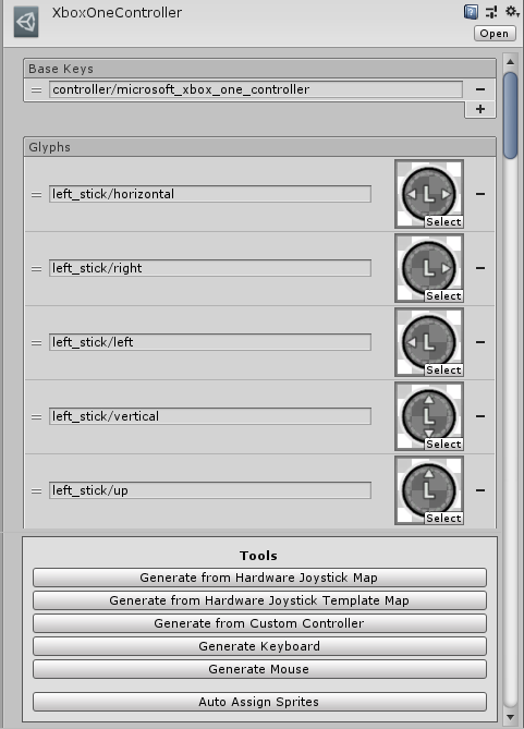
Glyph Set
A glyph set represents a list of string-keyed glyphs. You can create your own glyphs, for example, if you want different styling, to create glyphs for a controller that doesn't have any default glyphs, to create glyphs for your Custom Controllers, etc.
The default implementation is SpriteGlyphSet. This uses UnityEngine.Sprite as the glyph type. It is possible to use your own custom glyph types. See this for more information.
A Sprite glyph set for a controller or controller template. The inspector contains various convenience tools for generating glyph sets from controller and controller template definitions and Custom Controllers.
To create a Sprite Glyph Set:
- Assets -> Create -> Rewired -> Glyphs -> Sprite Glyph Set
| Base Keys | A list of base keys. Final keys will be composed of base key + glyph key. Setting multiple base keys allows one glyph set to apply to multiple controllers, for example. |
| Glyphs | The list of glyphs. |
Glyph Set Collection
A glyph set collection represents a list of glyph sets. This can be used to organize glyph sets into categories to work with them more easily. Glyph Set Collections can be chained, allowing you to organize glyph sets under one top-level collection, making it easy to swap out the entire set of glyphs for a different set. Examples of this might include having different glyph styles for different consoles / platforms or for localization purposes.
To create a Glyph Set Collection:
- Assets -> Create -> Rewired -> Glyphs -> Glyph Set Collection
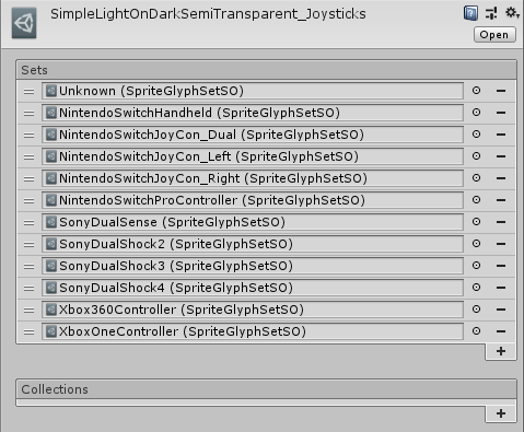
| Sets | The list of glyph sets. |
| Collections | The list of glyph set collections. |
Custom Glyph Types (Advanced)
Glyphs are exposed by the API as System.Object. This allows you to use any object type you want as a glyph and still access it through the API. You are not limited to UnityEngine.Sprite.
The various glyph set and glyph set collection classes can be reimplemented from their base classes to support any glyph object type.
- Create a class that inherits from GlyphSet, the base class of SpriteGlyphSet, specifying the new type. Copy the code of SpriteGlyphSet to start. (The Sprite Glyph Set custom inspector will also need to be copied and re-implemented if you want those features.)
- Create a class that inherits from GlyphOrTextBase<TGlyphComponent, TGlyphGraphic, TTextComponent>. Copy the code of UnityUIGlyphOrText to start. Create a new GlyphOrText prefab using the new class, then set that prefab to the default UnityUI glyph or text prefab.
Unity UI Text Mesh Pro Glyph Helper
 A helper class to display Rewired glyphs and display names inline in TMPro Text (Unity UI). Parses tags within text and replaces them with Sprites or text. Enter text in this component's text field, not in the TMPro Text field. Text entered here will be parsed, then the Text Mesh Pro Text component will be updated with the text, including Sprite tags.
It is important to understand that the purpose of this component is for displaying UI help glyph / text to show the user what controller element to press to activate an Action. In most cases, this is used to display the glyph for the last active controller. By default, this component selects the first match it finds in the Player based on the specified criteria. By default, it requires that the Player currently contains a Controller and an enabled Controller Map with at least one enabled binding to the Action in question. (For more advanced use cases, see custom filtering of results, custom result selection, and displaying glyphs for controllers not currently connected.)
If you are attempting to display glyphs in a control rebinding UI, this is not the correct component to use. Use the Unity UI Controller Element Glyph component instead.
To use it, create a Text Mesh Pro UGUI object, select the GameObject, and add the component from the menu:
- Component -> Rewired -> Glyphs -> Unity UI -> Unity UI Text Mesh Pro Glyph Helper
Inspector
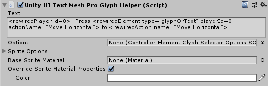
| Text | Enter text into this field and not in the TMPro Text field directly. Text will be parsed for special tags, and the final result will be passed on to the Text Mesh Pro Text component. See this for more information about tags. |
| Options | Optional reference to an object that defines options. If blank, the global default options will be used. |
| Sprite Options | Options that control how Text Mesh Pro displays Sprites.
|
| Base Sprite Material | Optional material for Sprites. If blank, the default material will be used. Material is instantiated for each Sprite Asset, so making changes to values in the base material later will not affect Sprites. Changing the base material at runtime will copy only certain properties from the new material to Sprite materials. |
Override Sprite Material Properties |
If enabled, local values such as Sprite color will be used instead of the value on the base material. |
| Sprite Material Properties | These properties will override the properties on the Sprite material if Override Sprite Material Properties is enabled.
|
Various options can be set that determine which glyph will be selected. This includes choosing to use the last active controller or not, the priority order of different controller types and controller element types, and other options. For example, you might choose to prioritze keyboard glyphs over mouse glyphs or vice versa. (In this class, the keyboard and mouse are treated as a single controller for the purposes of last active controller.)
If the options field is left blank, it will use the default options specified in ControllerElementGlyphSelectorOptions.defaultOptions. You can set this value or change the individual options values and all glyphs that use the default options will reflect these changes. (You can also set the default options in the inspector using this convenience component.) If the options field is set, the local options will be used.
You can create a selector options asset file and share the settings among different glyphs. The options field takes a reference to an object of type ControllerElementGlyphSelectorOptionsSOBase. You can create a ControllerElementGlyphSelectorOptionsSO from the menu:
- Assets -> Create -> Rewired -> Glyphs -> Controller Element Glyph Selector Options
Text containing the below tags will be converted into glyphs / text for the specified parameters.
Display controller element glyph or display name of controller elements bound to an Action in a Player:

    <rewiredElement [attributes]>

    Attributes:
        type="[glyphOrText|gt|glyph|g|text|t]" (optional, default: glyphOrText)
        playerId=[player_id] (id or name required)
        playerName="[player_name]" (id or name required)
        actionId=[action_id] (id or name required)
        actionId2=[action_id_2] (optional)
        actionName="[action_name]" (id or name required)
        actionName2="[action_name_2]" (optional)
        actionRange="[full|f|positive|pos|p|+|negative|neg|n|-]" (optional, default: full)
        firstPole="[positive|pos|p|+|negative|neg|n|-]" (optional, default: negative)
        action2FirstPole="[positive|pos|p|+|negative|neg|n|-]" (optional, default: [value of firstPole])
        resultIndex=[result_index] (optional, default: 0)

    Example:
        <rewiredElement playerId=5 actionName="MoveHorizontal" actionRange="full">

Display the name of an Action:

    <rewiredAction [attributes]>

    Attributes:
        id=[action_id] (id or name required)
        name=[action_name] (id or name required)
        range="[full|f|positive|pos|p|+|negative|neg|n|-]" (optional, default: full)

    Example:
        <rewiredAction name="MoveHorizontal" range="positive">

Display the name of a Player:

    <rewiredPlayer [attributes]>

    Attributes:
        id=[action_id] (id or name required)
        name=[action_name] (id or name required)

    Example:
        <rewiredPlayer id=0>
| <rewiredElement> Attributes | Description | Values |
| type | Determines if glyphs, text, or both is allowed to be displayed. If set to GlyphsOrText, glyphs will be displayed if available, falling back to text if not. |
glyphOrText, gt |
| playerId | The id of the Player for which glyphs will be displayed. (Either playerName or playerId is required.) | (Integer id of the Player) |
| playerName | The name of the Player for which glyphs will be displayed. (Either playerName or playerId is required.) | (Name of the Player) |
| actionId | The id of the Action for which glyphs will be displayed. (Either actionId or actionName is required.) | (Integer id of the Action) |
| actionId2 | The id of the second Action for which glyphs will be displayed. (Optional.) | (Integer id of the Action) |
| actionName | The name of the Action for which glyphs will be displayed. (Either actionId or actionName is required.) | (Name of the Action) |
| actionName2 | The name of the second Action for which glyphs will be displayed. (Optional.) | (Name of the Action) |
| actionRange | The range of the Action for which to show glyphs / text. This determines whether to show the glyph for an axis-type Action (ex: Move Horizontal), or the positive/negative pole of an Action (ex: Move Right). For button-type Actions, Full and Positive are equivalent. This value has no effect when displaying two Actions. |
full, f positive, pos, p, + negative, neg, n, - |
| firstPole | Determines the display order of split-axis and button glyphs for the first Action. When two glyphs for a axis-type action are displayed, this determines which pole is displayed first. If action2FirstPole is not set, this value will be used for action2FirstPole. |
positive, pos, p, + negative, neg, n, - |
| action2FirstPole | Determines the display order of split-axis and button glyphs for the second Action. When two glyphs for an axis-type action are displayed, this determines which pole is displayed first. If displaying glyphs for two Actions, if this value is not set, the value of firstPole will be used for the second Action. |
positive, pos, p, + negative, neg, n, - |
| resultIndex | The index of the result to return. This can be used to return, for example, the second matching glpyh(s) instead of the first found. This will be ignored if you are using a custom result selector. | (Integer index) |
| <rewiredAction> Attributes | Description | Values |
| id | The id of the Action. (Either id or name is required.) | (Name of the Action) |
| name | The name of the Action. (Either id or name is required.) | (Integer id of the Action) |
| range | The range of the Action. This determines whether to show the name of the axis-type Action (ex: Move Horizontal), or the positive/negative pole of an Action (ex: Move Right). For button-type Actions, Full and Positive are equivalent. | full, f positive, pos, p, + negative, neg, n, - |
| <rewiredPlayer> Attributes | Description | Values |
| id | The id of the Player. (Either id or name is required.) | (Integer id of the Player) |
| name | The name of the Player. (Either id or name is required.) | (Name of the Player) |
Custom Filtering of Element Glyphs (<rewiredElement> tag)
By default, glyphs will be displayed for the first match found in the Player, excluding disabled Controller Maps and Action Element Maps. If you need the ability to define which mappings are displayed, including potentially from disabled Controller Maps or from Controller Maps in only specific Map Categories for example, you can define your own filtering code by setting the UnityUITextMeshProGlyphHelper.isRewiredElementAllowedHandler property. See the code example below for ideas.
Note that the ControllerElementGlyphSelectorOptions method of custom filtering also works with this component, but has the disadvantage that the same filter will apply to all <rewiredElement> tags, whereas the UnityUITextMeshProGlyphHelper.isRewiredElementAllowedHandler method allows to you apply filtering separately for each tag if desired. If UnityUITextMeshProGlyphHelper.isRewiredElementAllowedHandler is set, it will override filtering set in ControllerElementGlyphSelectorOptions.
using UnityEngine;
using Rewired;

[RequireComponent(typeof(Rewired.Glyphs.UnityUI.UnityUITextMeshProGlyphHelper))]
public class GlyphFilteringTMPro : MonoBehaviour {

    private Rewired.Glyphs.UnityUI.UnityUITextMeshProGlyphHelper tmProGlyphHelper {
        get {
            return GetComponent<Rewired.Glyphs.UnityUI.UnityUITextMeshProGlyphHelper>();
        }
    }

    public void OnEnable() {
        // Assign the handler
        tmProGlyphHelper.isRewiredElementAllowedHandler += FilterGlyphs;
    }

    public void OnDisable() {
        // Remove the handler
        tmProGlyphHelper.isRewiredElementAllowedHandler -= FilterGlyphs;
    }

    bool FilterGlyphs(int tagIndex, ActionElementMap aem) {

        // If you need different filtering for multiple rewiredElement tags, check tagIndex
        if (tagIndex == 0) { // this is the first tag
            // do something different
        }

        // Exclude disabled ActionElementMaps
        if (!aem.enabled) return false;

        // Exclude if parent Controller Map is disabled
        if (!aem.controllerMap.enabled) return false;

        // Include only if Controller Map is in the "Gameplay" Map Category
        if (aem.controllerMap.categoryId != ReInput.mapping.GetMapCategoryId("Gameplay")) return false;

        // Include only if controller is a Joystick
        if (aem.controllerMap.controller.type != ControllerType.Joystick) return false;

        // Include only if controller element is a Button
        if (aem.elementType != ControllerElementType.Button) return false;

        return true;
    }
}
Custom Selection of Element Glyphs Results (<rewiredElement> tag)
By default, glyphs will be displayed for the first match found in the Player. If you instead want to manually choose which matching result to display, you can do so by setting a custom result selection handler using the UnityUITextMeshProGlyphHelper.rewiredElementResultSelectionHandler property. After searching for mappings in the Player and collecting all possible results, the handler will be invoked. This can be used, for example, to display the second result found instead of the first. (If all you need is to select a result by index, it's easier just to set the
resultIndex attribute in the rewiredElement tag instead.) It could also be used to choose results from any user-defined criteria such as controller type, controller map cateogry, etc.
The following is a simple example showing how to set a custom result selector and choose a result by index, for example if you want to display the second matching result found to show glyphs for "primary" and "secondary" controls. Add this component to the GameObject containing the UnityUITextMeshProGlyphHelper component and set the result index in the inspector.
namespace Rewired.Examples {
    using System.Collections.Generic;
    using UnityEngine;
    using Rewired.Glyphs;
    using Rewired.Glyphs.UnityUI;

    [RequireComponent(typeof(UnityUITextMeshProGlyphHelper))]
    public class UnityUITextMeshProGlyphHelperResultSelectionExample : MonoBehaviour {

        [Tooltip("The index in the glyph result list to use. If there is no result at the specified index, nothing will be displayed.")]
        public int resultIndex = 0;

        private UnityUITextMeshProGlyphHelper glyph {
            get {
                return GetComponent();
            }
        }

        private void OnEnable() {

            // Set the custom result selection handlers

            // For one Action queries
            glyph.rewiredElementResultSelectionHandler = GlyphResultSelectionHandler;

            // For two Action queries (optional)
            glyph.rewiredElementResult2dSelectionHandler = GlyphResult2DSelectionHandler;
        }

        private void OnDisable() {

            // Unset the custom result selection handler
            glyph.rewiredElementResultSelectionHandler = null;
            glyph.rewiredElementResult2dSelectionHandler = null;
        }

        private int GlyphResultSelectionHandler(int tagIndex, IList<ActionElementMapPair> results) {

            // The tag index is provided if you want to choose a different result depending on the tag.
            // You can iterate the list and choose the best result.
            // Return the index of the result to display.
            // This example just returns the result index set in the inspector.

            // Note that if all you need is to select a result by index, it's easier just to set the
            // resultIndex attribute in the rewiredElement tag instead.

            return resultIndex;
        }

        private int GlyphResult2DSelectionHandler(int tagIndex, IList<Pair<ActionElementMapPair>> results) {

            // The tag index is provided if you want to choose a different result depending on the tag.
            // You can iterate the list and choose the best result.
            // Return the index of the result to display.
            // This example just returns the result index set in the inspector.

            // Note that if all you need is to select a result by index, it's easier just to set the
            // resultIndex attribute in the rewiredElement tag instead.

            return resultIndex;
        }
    }
}
Glyphs appear correctly in the editor but appear as raw tag text in a build (Unity 2020-2023)
Update: As of Rewired 1.1.60.0, this is no longer an issue and installing the script is not necessary or helpful.
In builds made with Unity Player Managed Stripping Level is set to Medium or High, important properties may be stripped from some Text Mesh Pro classes used by this component (due to the use of reflection). If this happens, glyphs for multiple controllers will not display in a build. The first controller's glyphs may be displayed, but glyphs for subsequent controllers used will not. For example, if switching between mouse and a gamepad, the gamepad's glyphs may not display when switching to the gamepad, instead displaying the raw tag text instead.
To resolve this issue, code must be added that calls the specific Text Mesh Pro properties used by the component to prevent them from being stripped. Download this script and add it to your project.
Note: This script will not work on very old versions of Text Mesh Pro and will result in compiler errors. This script is not necessary and should not be installed for these versions of Text Mesh Pro.
Accessing Glyphs from Scripts
The various glyph-related members are as follows:
- ControllerElementIdentifier.glyph
- ControllerElementIdentifier.positiveGlyph
- ControllerElementIdentifier.negativeGlyph
- ControllerTemplateElementIdentifier.glyph
- ControllerTemplateElementIdentifier.positiveGlyph
- ControllerTemplateElementIdentifier.negativeGlyph
- ActionElementMap.glyph
- ActionElementMap.positiveGlyph
- ActionElementMap.negativeGlyph
- ActionElementMap.GetElementIdentifierGlyphs
Key Format
Glyph keys are strings that are formatted as a path.
All keys, with the exception of special fallback keys, can be exported from the Rewired Editor -> Tools page.
Note: The [brackets] below are not part of the key. Items in brackets represent a variable value.
For recognized controllers of all types:
| controller/[controller_key] | A specific controller. |
| controller/[controller_key]/[element_key] | An element on a specific controller. |
| controller/keyboard | The keyboard. |
| controller/keyboard/[element_key] | A keyboard key. |
| controller/mouse | The mouse. |
| controller/mouse/[element_key] | A mouse element. |
| controller/custom/[controller_key] | A specific custom controller. |
| controller/custom/[controller_key]/[element_key] | An element on a specific custom controller. |
| controller/element/[element_key] | A generic controller element. |
| controller/template/[controller_template_key] | A specific controller template. |
| controller/template/[controller_template_key]/[element_key] | An element on a specific controller template. |
Example:
The glyph key for an Xbox One controller is:
controller/microsoft_xbox_one_controller
The glyph key for the left stick horizontal axis on an Xbox One controller is:
controller/microsoft_xbox_one_controller/left_stick/horizontal
On most platforms, unrecognized controllers will use the Unknown Controller definition and its keys. On specific platforms when using specific input sources, handling for unrecognized controllers of specific types may be handled differently. See this.
| controller/unknown_controller | Unknown Controller. |
| controller/unknown_controller/[element_key] | An element on an Unknown Controller. |
When controller element glyph key lookups are performed, if a matching glyph is not found, additional keys will be tried. Most-specific keys are tried first, falling back progressively to least-specific until a match is found or no there are no more fallback options.
Keys in the tables below are listed in order of precedence, with first in list being highest precedence. This list applies to recognized Joysticks.
| controller/[controller_key]/[input_source_hardware_info]/[element_key] | Hardware Specific Rare special case for certain devices on some input sources / platforms. See below. |
| controller/[controller_key]/[element_key] | Base Controller This is the most common match type. |
| controller/[input_source_special_controller_key]/[element_key] | Input Source Special Fallback Only if controller on current input source has additional fallbacks. |
| controller/element/[element_key] | Element Only Fallback |
| controller/template/[element_key] | Controller Template Only if controller implements a Controller Template. |
If no glyph is found for the specific controller, you can still match on element only. This allows you to define glyphs for generic controller elements without knowing anything about the controller they may appear on. For example, creating a glyph with the key controller/element/dpad/up will match to any controller element that has the key dpad/up. This isn't terribly useful for gamepads, because they will be handled by Controller Template fallback (see below), but for other controller types, this may prove useful. (Racing wheels, flight sticks, Custom Controllers, etc.)
You can see from the above list that, if a controller implements a Controller Template, if no matching keys are found for the specific device or the elements themselves, it will fallback to Controller Template keys for the controller elements. For example, this allows all recognized gamepads that implement the Gamepad Template to automatically display Gamepad Template glyphs. If controller-specific glyphs are available, they will take precedence over Template glyphs.
Special Matching on Specific Input Sources
On specific platforms, when using specific input sources, for specific devices, additional key variants may be used. In some cases, these key variants are more specific and will be attempted before the primary key, in other cases the key variants are act as additional fallback options.
Keys in the tables below are listed in order of precedence, with first in list being highest precedence.
Because the below special keys rely on information supplied by a connected controller, you cannot get glyphs or localized strings for these special keys when the controller is not connected. The ReInput.mapping.GetControllerMapInstance functions to see mappings for a non-connected controller cannot generate these special keys because they are dependent on data supplied by the hardware. To avoid issues, if you intend to display glyphs or element names for controllers that are not connected, do not localize names or make glyphs for these special special keys below.
| Windows Gaming Input, unrecognized, Gamepad profile: | (Element keys from Xbox One Controller definition) |
| This list only applies to unrecognized controllers. For recognized devices, such as Dual Shock 4, the following does not apply. | |
| controller/windows_gaming_input_gamepad/[vendor_id_hex:product_id_hex] | Specific hardware target Vendor / Product Id example: 045e:0202 (lower case) |
| controller/windows_gaming_input_gamepad | Universal fallback gamepad |
| controller/microsoft_xbox_one_controller | Xbox One fallback |
| Windows Gaming Input, Steam-Configured, unrecognized, Gamepad profile: | (Element keys from Steam Controller definition) |
| This list only applies to unrecognized controllers. For recognized devices, such as Dual Shock 4, the following does not apply. | |
| controller/steam_controller/[vendor_id_hex:product_id_hex] | Specific hardware target |
| controller/steam_controller | Steam Controller fallback |
| MacOS, Game Controller Framework, unrecognized, Gamepad profile: | (Element keys from Apple Mfi Gamepad definition) |
| This list only applies to unrecognized controllers. For recognized devices, such as Dual Shock 4, the following does not apply. | |
| controller/apple_mfi_gamepad/[product_name] | Specific hardware target
|
| controller/apple_mfi_gamepad/[product_category] | Product category target (matching case) |
| controller/apple_mfi_gamepad | Apple MFi fallback |
| iOS/tvOS, Unity Input, Gamepad profile: | (Element keys from Apple Mfi Gamepad definition) |
| controller/apple_mfi_gamepad/[product_name] | Specific hardware target |
| controller/apple_mfi_gamepad | Apple MFi fallback |
| Android, Unity Input, Standardized Gamepad (if Support Unknown Gamepads enabled): | (Element keys from Standardized Gamepad definition) |
| controller/standardized_gamepad/[product_name] | Specific hardware target |
| controller/standardized_gamepad | Standardized Gamepad fallback |
| Linux, Unity Input, Pre-Configured Gamepad: | (Element keys from Unity Preconfigured Controller definition) |
| controller/unity_linux_preconfigured_gamepad/[product_name] | Specific hardware target |
| controller/unity_linux_preconfigured_gamepad | Unity Pre-Configured Gamepad fallback |
| WebGL, Native, unknown, Gamepad profile: | (Element keys from Standardized Gamepad definition) |
| controller/standardized_gamepad/[vendor_id_hex:product_id_hex] | Specific hardware target Vendor / Product Id example: 045e:0202 (lower case) |
| controller/standardized_gamepad/[product_name] | Specific hardware target |
| controller/standardized_gamepad | Standardized Gamepad fallback |
| SDL2, unknown, Gamepad profile: | (Element keys from Standardized Gamepad definition) |
| controller/standardized_gamepad/[vendor_id_hex:product_id_hex] | Specific hardware target Vendor / Product Id example: 045e:0202 (lower case) |
| controller/standardized_gamepad/[product_name] | Specific hardware target |
| controller/standardized_gamepad | Standardized Gamepad fallback |
FAQ
Q: How can I display glyphs for a controller that is not currently connected or assigned to the Player?
A: (Rewired 1.1.61.0+) You must specify a valid default controller in the ControllerElementGlyphSelectorOptions and enable Use Default Controller. Glyphs for the default controller will only be displayed if no other glyphs are found for the controllers currently assigned to the Player. On console platforms, you will have to unassign the Keyboard and Mouse controllers from the Player if you want to display the default controller glyphs when no controller is currently connected or assigned to the Player.
Options can be set in the Options field per glyph component in the inspector or globally using the Unity UI Default Controller Element Glyph Settings convenience component or through scripting using ControllerElementGlyphSelectorOptions.defaultOptions. For recognized controllers, set only the Controller Type and the Hardware Type Guid, do not specify a Hardware Identifier which is only useful for unrecognized controllers and differs based on the platform and input source in use. The Hardware Type Guid of recognized controllers can be found in the Hardware Joystick Map controller definition located at Rewired/Internal/Data/Controllers/HardwareMaps/Joysticks/ or in this CSV file.
Note that Last Active Controller cannot include controllers not currently connected, so the last controller used will not be retained when disconnected. The only way to display glyphs for a controller not currently connected is by setting the default controller in the ControllerElementGlyphSelectorOptions.